Display Your Website or Application in a Realistic Device Layout Using the device-layouts NPM Package
Learn how to showcase your website or application in a professional manner by using the device-layouts package, and customize the device layout styles

a simple man
Hello Devs 😊
Introduction:
The device-layouts npm package is a useful tool for web developers who want to showcase their website or application in a realistic device layout. It provides MacBook and iPhone device frames in SVG format that can be easily integrated into a web page. In addition to its default features, the package also allows you to customize the CSS styles of the device layouts. In this article, we will explore how to customize the CSS styles of the device-layouts package.
Installation:
The first step in using the device-layouts package is to install it in your project. You can do this by running the following command in your terminal:
npm install device-layouts
Once the installation is complete, you can start using the package in your project.
Usage:
To use the device-layouts package, you need to import it into your project and pass an element to be displayed in the device layout. Here's an example:
import React from "react";
import Layouts from "device-layouts";

const App = () => {
  const element = (
    <div>
      <iframe
        src="https://www.example.com"
        width="100%"
        height="800"
      ></iframe>
    </div>
  );
  const { Laptop, Iphone } = Layouts({ element });
  return (
    <>
      <Laptop />
      <Iphone />
    </>
  );
};

export default App;
CSS Styles: The device-layouts package also allows you to customize the CSS styles of the device layouts. You can add new styles or override the pre-defined ones. The pre-defined CSS styles are located in ./src/assets/css/style.css and include the following classes:
laptop_layoutiphone_layoutlaptop_layout_childiphone_layout_child
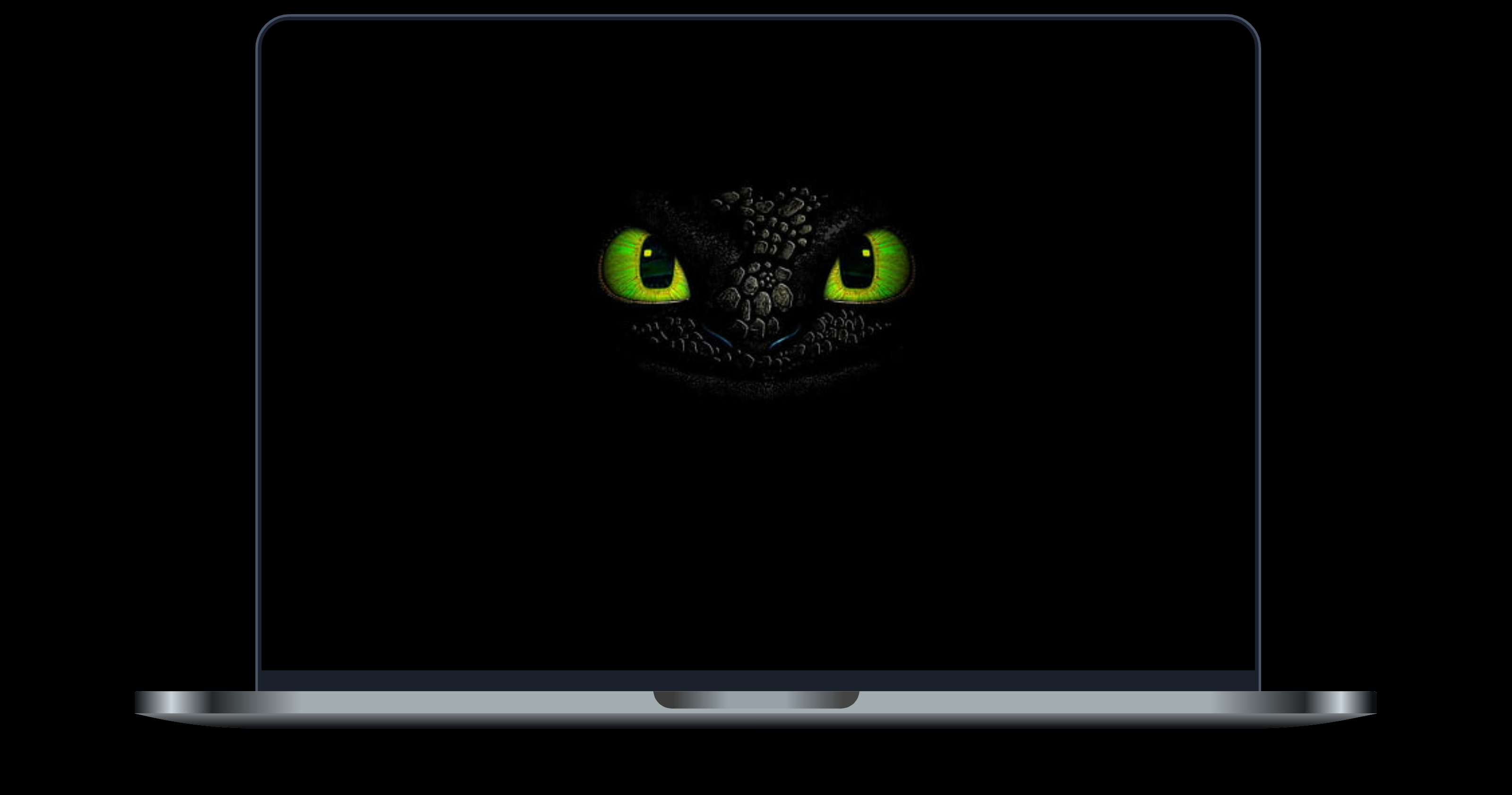
Laptop Layout:

iPhone Layout:

Conclusion:
In this article, we have explored how to use the device-layouts npm package to display your website or application in a realistic device layout.
The device-layouts package is a useful tool for web developers who want to showcase their projects in a realistic and visually appealing way.
Happy Coding ☕


